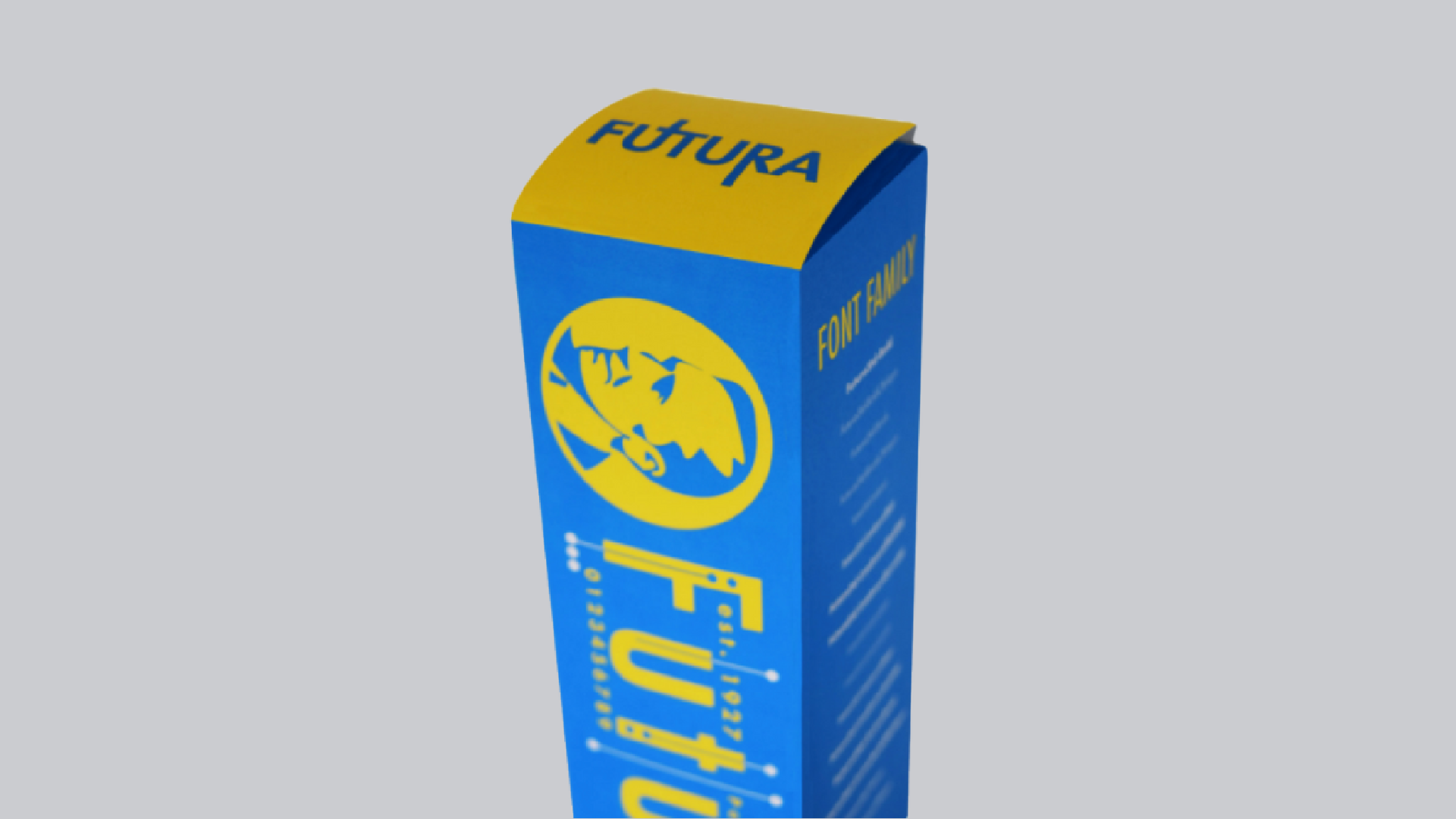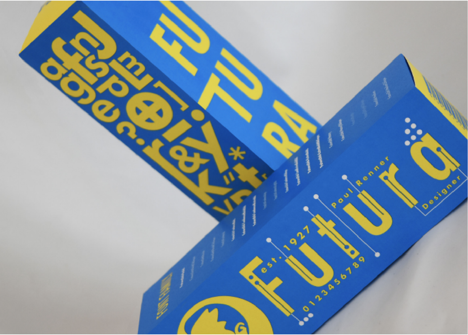
One of the most common staples of font libraries, a typeface that has graced countless logos, a formidable font that looks just as modern today as it did when it was first released in 1927 —the one and only Futura. Its anatomy employs low-contrast strokes, meaning that the width of the strokes is nearly uniform throughout the form of each letter. For 90 years, Futura has remained the typeface of our time.